- Qualcomm Launches Snapdragon 4 Gen 2 Mobile Platform
- AMD Launches Ryzen PRO 7000 Series Mobile & Desktop Platform
- Intel Launches Sleek Single-Slot Arc Pro A60 Workstation Graphics Card
- NVIDIA Announces Latest Ada Lovelace Additions: GeForce RTX 4060 Ti & RTX 4060
- Maxon Redshift With AMD Radeon GPU Rendering Support Now Available
Adobe Photoshop Lightroom 3 – A Photographer’s Review

To produce top-rate photos, more is needed than just a camera and lens. You need tailored software that’s designed for post-processing raw camera images, and no, not Photoshop. Rather, Photoshop Lightroom, software that gives you utmost control over your photos. We’re taking a look at the recently released version 3.
Page 3 – Organizing Your Shoot
The beauty of a well-made piece of workflow software is that it is designed to be your main “hub.” It should know where to go and how to handle all of the basic tasks of producing a final product, starting with importing from camera and going all the way to Web pages, slideshows or printing.
In between these two tasks exist the two reasons we need this software to begin with – we need to sort through what we took, and then whether for artistic purpose or just to fix a booboo, we need to edit. LR3 breaks these processes into chunks with a beautiful tab interface – the Library, for sorting and choosing; the Develop area, for adjustments; and then the export tabs – Print, Slideshow and Web.
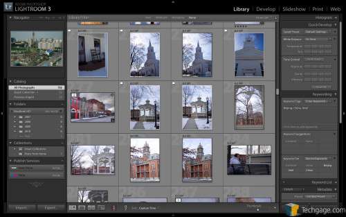
Organization in particular is truly where Lightroom shines over all other products in the field, especially over its rival Aperture. The Library has copious amounts of ways to sort your images – whether you just want to look at the newest imports, search by keywords, equipment, color tags, rating or simply date/time. The search bar is integrated into the top of the window (though it can be minimized), and is intuitive to use.
To the left side of the library is an improved “Collections” area, where you can create groups of images for later retrieval, and even have them update themselves based on criteria you set so that new additions are always where they should be. This takes a ton of work out of the manual process of adding images to more than one collection.
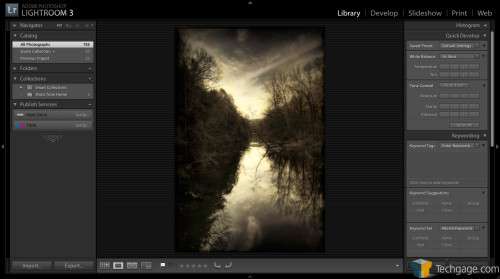
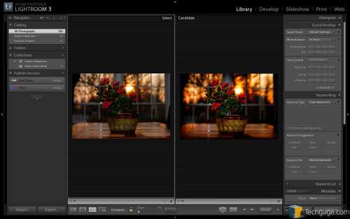
On the right is a panel showing information about the selected image, including all of its metadata. Images here can be grouped, flagged, and quickly viewed at four zooms ranging from thumbnail to 1:1 pixel ratio. They can then be compared (any number, side by side) to determine the best shot of a series, and removing the unwanted ones is as simple as hitting the letter X (to flag as rejected).
This interface hasn’t changed much since Lightroom’s first release, but it has received a multitude of tweaks – and LR3 is no different. The search bar is now more intuitive for helping quickly sort a shoot between picks, rejects and “hmmm… keep but don’t worry about.”
Different people familiar with the old interface may like or dislike these tweaks, but to me they make a lot of sense. Much of the time that I need to worry about really organizing is wasted on determining which out of a series of shots is the keeper, and anything that gets me to working with my top shots faster is a good thing.
Support our efforts! With ad revenue at an all-time low for written websites, we're relying more than ever on reader support to help us continue putting so much effort into this type of content. You can support us by becoming a Patron, or by using our Amazon shopping affiliate links listed through our articles. Thanks for your support!


