- Qualcomm Launches Snapdragon 4 Gen 2 Mobile Platform
- AMD Launches Ryzen PRO 7000 Series Mobile & Desktop Platform
- Intel Launches Sleek Single-Slot Arc Pro A60 Workstation Graphics Card
- NVIDIA Announces Latest Ada Lovelace Additions: GeForce RTX 4060 Ti & RTX 4060
- Maxon Redshift With AMD Radeon GPU Rendering Support Now Available
Asheron’s Call: Throne of Destiny Preview

Turbine is getting ready to launch the latest expansion pack for their Asheron’s Call game, entitled “Throne of Destiny”. Will this expansion be enough to please current and old players of the game? Let’s take a good hard look at all ToD has to offer to make that decision.
Page 1 – Introduction
I have been playing Asheron’s Call for almost three and half years, so you can expect a lot of ‘expert’ opinion throughout the preview. Playing the game for that amount of time, easily shows that I enjoy the game quite a bit, and I do. So when I first heard of an expansion pack, needless to say, I got excited very quickly. That being said, I had very high expectations.. so did Turbine meet them? For those who have not played Asheron’s Call before, here is a quick sum up of the story line:
Asheron’s Call develops a heroic fantasy setting familiar enough to draw you in yet mysterious enough to draw you onward. A varied host of monsters populate the benighted, medieval terrain; mysterious artifacts of great power embellish vast treasure hoards; and sorcerers, fighters, and rogues plot both heroic alliances and base villainy. However, Asheron’s Call retains a strong flavor all its own, with an original back story and creatures, and unparalleled flexibility in character creation and development. After selecting your attire and facial features from millions of possible combinations, customize your skill set to make your character truly unique. As you defeat foes, you can allocate experience to not only specific skills but also the base attributes like strength and intelligence. And the allegiance system grants you power and prestige as you recruit followers to your service. Enter the vast and magical world of Dereth, where a new and heroic identity awaits you!
AC originally launched in November of 1999, and up to now, have only one other expansion pack under their belt. Dark Majesty, the games first expansion pack, released in August of 2001, and is responsible for some of the land mass players roam in today. That expansion pack also launched player housing, where players could have a humble abode to call their own. You may be wondering why Turbine only released 1 expansion pack over the period 6 years, while such other companies like to release a new expansion pack per month. Well, I have no idea. But, to keep players happy, Turbine has released new content with a monthly patch, which well than made up for a complete expansion pack.
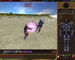
Note: All images are clickable. Full resolution pictures are 1280 * 1024 (250KB – 300KB)
Now we have Throne of Destiny. The reason they chose to release this as an expansion pack, rather than sum it all up in a monthly update, is because it promises to unveil a lot of content, which they say is equivalent to 5 monthly patches. As great as that sounds, Turbine stopped the monthly patches earlier this year, to prepare for the expansion pack. So that 5 months worth of content is well deserved, since players have gone that long without any new stuff.
The content that ToD adds however, almost makes up for the lack of new content.
Arguably, the most requested feature for the expansion pack, was upgraded graphics. Instead, Turbine gave us updated graphics, which is fine for many people. Personally, I didn’t want to see a huge overhaul, to something of the extent as Asheron’s Call 2, because I wanted the feeling that I was still playing AC1. They did a great job with this, however there are many disappointed players who were hoping for more.
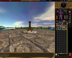
I admit, the updated graphics are nothing amazing, but they definitely work. The client has been overhauled, and updated with a new GUI (Graphical User Interface). The GUI acts as it always has, with minor tweaks and adjustments. The chat window, for instance, can now be stretched, rather than before, where you have two choices. This is a very welcomed feature, and should have been like this since the beginning.
The entire GUI template has been redone. Personally, I enjoy the new look. It’s similar to how it was before, but much more clean and easy to look at. Some players, again, are not so impressed. In all honesty, many players have created similar templates for the game, so I guess we expected more. Some notable new features though should not go disregarded. Now when doing some quests, or when you first enter the world, you will get a pop-up for easy reading, rather than looking in your chat window. Casting spells and performing certain actions will display the text at the top of your screen in red text, rather than small white text to the left, as before.
Support our efforts! With ad revenue at an all-time low for written websites, we're relying more than ever on reader support to help us continue putting so much effort into this type of content. You can support us by becoming a Patron, or by using our Amazon shopping affiliate links listed through our articles. Thanks for your support!


