- Qualcomm Launches Snapdragon 4 Gen 2 Mobile Platform
- AMD Launches Ryzen PRO 7000 Series Mobile & Desktop Platform
- Intel Launches Sleek Single-Slot Arc Pro A60 Workstation Graphics Card
- NVIDIA Announces Latest Ada Lovelace Additions: GeForce RTX 4060 Ti & RTX 4060
- Maxon Redshift With AMD Radeon GPU Rendering Support Now Available
Microsoft Visual Studio 11 Preview

With the next version of Visual Studio soon to be upon us, we’re taking a look at what’s worth waiting for. While some animosity exists around certain decisions made by Microsoft, VS11 brings a lot to the table, most notably the addition of a robust environment for creating Metro-based apps.
Page 1 – Introduction
The release of Microsoft’s Visual Studio 11 is right around the corner, and as the beta has been available for a while, we couldn’t avoid giving it a go. This is the de facto development tool for the Windows platform. While certainly not mandatory, it has nevertheless become pretty much the reference product for Windows development that all other products are compared to, for no other reason than Microsoft having Visual Studio as one of its greatest achievements. It’s in fact a superior product and for many the best IDE in existence on any platform.
It’s not however free of criticism. And for some inexplicable reason Microsoft made Visual Studio 11 one of the most controversial versions of all, if not the most. All for one reason and one reason alone; the Visual Studio 11 new user interface. Of all the things!
Microsoft has been taking a few risks lately. The decision to incorporate a Metro-style GUI in Windows 8 has so far been destitute of user consensus. It’s an even more aggressive move than the Windows Vista interface, which was only 4 years ago hailed by Microsoft as a great user interface that simplified Windows use.
What was probably not expected is that Microsoft would want to stretch the rope even further and do a complete makeover of Visual Studio 11 by giving it a Metro-style finish. The result was nothing but controversial among the developer community. Many like it, many dislike it. Both camps hardening their positions as we move forward towards launch day. Visual Studio 2010 also did a complete makeover of the UI, but it was largely successful, with developers being generally thankful of a more productive environment.
The first problem is that with every new version of Visual Studio, one seems to be expected to relearn how to use the program. This is wasted time and a potential problem for teams or companies which already work on tight release schedules. But there’s also significant changes to UI elements that can have an impact on how easily we can use the product or how effective it becomes in terms of productivity. An IDE isn’t a consumer-grade product that we can just do makeovers on as we please. It is a tool used in strict productivity contexts, and a tool used by professionals all over the world.
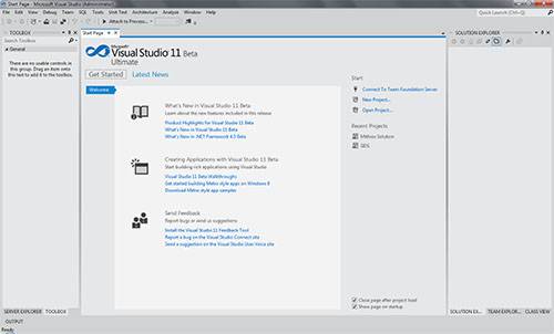
Visual Studio 11’s new UI has a Metro-style monochromatic look. It seems the reason is to bring out the color in the code window and application designers. This is a rather strange argument considering that it has never been a major issue with the developer community. Not even a minor issue to my knowledge.
The two most controversial changes are the monochromatic toolbars and the all-caps on toolbox titles. The first affects developers by making it harder for them to subconsciously identify and move the mouse cursor to the correct toolbox item. They all look very much alike, particularly on large resolution displays (a staple of most developer machines). The second is mostly an aesthetic issue, but one that also impacts readability. Microsoft has stated that both issues are under revision.
Microsoft did however make great improvements to the user interface on matters of productivity. It has been paying close attention to Visual Studio add-ins being developed for previous versions and it incorporated features of the widely used ones. Two of the most notable are the Quick Launch search box that gives the ability to search, locate and run any Visual Studio feature from a search box in the IDE, and also a significant increase in options on the several toolbox toolbars.
The new UI has had a great impact on me. The whole feel of Visual Studio moved from rich and easily identifiable visuals into a drab and worrisome experience. Visual Studio 11 just doesn’t feel right to me. It’s an all-gray, flat, tiring and depressing application I’m supposed to be looking at for hours on end — more than any other application in my history of Windows usage.
Support our efforts! With ad revenue at an all-time low for written websites, we're relying more than ever on reader support to help us continue putting so much effort into this type of content. You can support us by becoming a Patron, or by using our Amazon shopping affiliate links listed through our articles. Thanks for your support!


