- Qualcomm Launches Snapdragon 4 Gen 2 Mobile Platform
- AMD Launches Ryzen PRO 7000 Series Mobile & Desktop Platform
- Intel Launches Sleek Single-Slot Arc Pro A60 Workstation Graphics Card
- NVIDIA Announces Latest Ada Lovelace Additions: GeForce RTX 4060 Ti & RTX 4060
- Maxon Redshift With AMD Radeon GPU Rendering Support Now Available
Windows 8 Review – Part One: The Things I Hate
You’ve heard it here first: Microsoft is about to release a new version of Windows. Called “Windows 8”, the OS aims to change the way we use our computers, and it’s been built from the ground up with touch in mind. Like all other OS releases, there’s both things to admire and things to complain about. First, we’ll tackle the latter.
Page 1 – Introduction & Start Screen Quirks
“Oh look – it’s Rob writing a W8 H8 article, what a…”
… I’m a let you finish, but Windows 8 is one of the best OSes of all time! There, I said it. Put the pitchforks down, and hear me out.
That sentiment may sound a bit odd coming from someone who hasn’t exactly been too kind towards some of Microsoft’s decisions with its latest OS, but after having finally spent a lot of time with it, I’ve lightened up. In fact, I’ve reached a point where I’m fine with waving farewell to Windows 7 and will usher the Windows 8 era in with open arms.
So, why an article like this? Because Windows 8 isn’t perfect. Sure, no OS is, but when you transition over to a new version of an OS you’re very comfortable with, even the smallest problems stand out like a sore thumb. I am not going to be listing every minute detail here that I’ve had a problem with, but will talk about those that have left me scratching my head. Consider this a Service Pack 1 wishlist.
I can still see some pitchforks at half-mast, so let me preface this list by saying that a “Things I Love About Windows 8” follow-up is on route. After all, it’d be a little strange to hate on an OS I actually enjoy, and leave it at that.
Also note that some of these things may come off as being fairly petty, but the goal of this article isn’t for it to be a definitive list, one that most people can side with. This is a personal list of issues and odd decisions that stand out to me. It could even be that I’m overlooking a major issue – but if I don’t experience it, or if it doesn’t directly affect me anyway, I won’t know about it. Your opinions, kind or filled with vitriol, and your own list of likes / dislikes are, as always, welcomed in our related forum thread.
With that all said, let’s get right to it.
Start Screen: This is our only choice?
It should come as a surprise to no one that one of the biggest issues people have with Windows 8 is its new “Start screen”, or “Modern UI”. I belong in that camp, no question. When I first laid my eyes on this over-glorified Start menu, I about wanted to <fill in with some PC violence cliché>. We’ve been using the same Start menu, more or less, since Windows 95, and I think it’s safe to say that many of us are quite used to it. So to take an integral part of Windows that we’re all used to, put it in a blender and come out with this… no other word can sum it up better than “ugh”.
That opinion, for the most part, hasn’t changed too much with some full-time usage. I still fully believe that Microsoft should have offered people a choice between the Start menu we’ve known for so long, and this. With this, I am reminded of the move KDE made years ago with its transition from a simple Windows 98-esque “KMenu” to the “Kicker” menu. I didn’t like the Kicker menu at all, but fortunately enough, the KDE devs allowed me to simply right-click the menu and switch back. KDE was then able to offer what it felt like was the best solution, but allowed those who didn’t like it to go back to what they were used to.
Microsoft, on the other hand, has proven that it just doesn’t care what people want with regards to their Start solution. If you’re in need of definitive proof, just take a look at Windows Server 2012, which also uses it. A server OS that uses a Start menu like this. I’m of the mind a server OS shouldn’t even have a GUI to begin with, but this is over-the-top, and is sure to make IT adoption excruciatingly slow.
This problem, to me, is the #1 issue with Windows 8. Microsoft should have given its customers a choice, but instead insists that they adopt this new solution. And trust me, it does have a learning-curve, and for people who’ve been using Windows for many years, that’s just not expected. And don’t think I’m against change – because I’m not. But I am against companies forcing their customers into a drastic change they may not want.
The issues with the Start screen don’t end there, so let’s continue.
Start Screen: It takes up the entire screen
Desktop-level multi-tasking is just not expected on a mobile device – that is, to run two or more programs side-by-side. But Windows 8 is an OS for desktops along with mobile devices, so why are the options limited with regard to running Modern UI apps alongside desktop apps?
A scenario: I for some reason want to read news, check up on sports results or perhaps even play a game in the Modern UI. But at the same time, I want to be able to monitor an IRC chat room, a download I have in progress, a compiler doing its thing and so forth. In the current implementation, this is not possible – at least, not ideally.
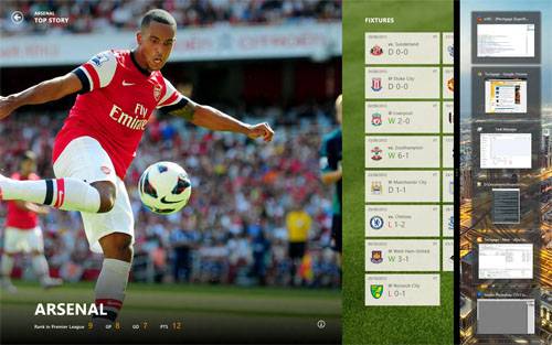
A new feature with Windows 8 is “snap” – the ability to run the Modern UI in one portion of the screen and the desktop in the other. This would be a perfect solution if the ratio for each weren’t fixed – it’s something like 20% for one and 80% for the other. If I run my desktop in that 20%, all I see are small representations of the applications I have open. I can see if a new message hits the IRC chat room, but to check it I have to click on the small preview, which then gets rid of the Start screen until I return to it. Clunky is putting it mildly.
A good start would be having the Snap ratio customizable. But even better would be having the desktop portion of the preview – when the Modern UI is dominant – fully usable, rather than resorting to previews.
Start Screen: Killing Modern UI apps is unintuitive
To my knowledge, there’s no “proper” way to kill an app you have open in the Start screen. While many of these will utilize minimal resources, I’ve become accustomed to not having things run in the background that I’m not using. It’s a beef I have with mobile OSes in general. It drives me insane when I see applications in the task manager on any of my Android devices that I haven’t run in weeks or even a month. It might not be using many resources, but it should be using none.
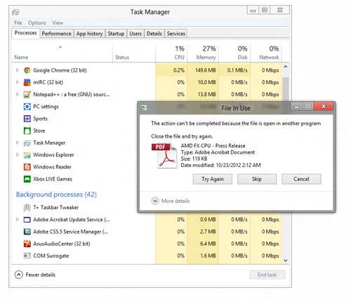
To kill an app, your best solution is to simply hit Alt + F4. At its heart, it’s still an application. Where killing apps may become necessary is when you use them to view documents. I had tried to delete a PDF the other day, for example, but couldn’t, because it was still open inside of Microsoft’s PDF reader. Once I went back to it, and hit Alt + F4, it took about 60 seconds before the file was totally freed so that I could delete it.
It seems likely to me that many will end up running into a similar issue like this, and their only solution will be to reboot the PC – unless of course they know what exactly is holding the file.
Oct 27 Addendum: As has been pointed out in our forum thread, the proper way to kill a Windows 8 app is to “grab” it from the top of the screen, and then drag it to the bottom.
Start Screen: No advanced tile properties
Windows has long offered you the ability to adjust the properties of a shortcut so that you have a program launch the way you need it to. For example, if you wanted a program to always launch as Administrator, you could configure it to do that. The same applies to running a program under compatibility mode, adjust its “Start in” variable (important for certain apps, like Folding@home) and how to launch it. With the Start screen, this flexibility is completely taken away.
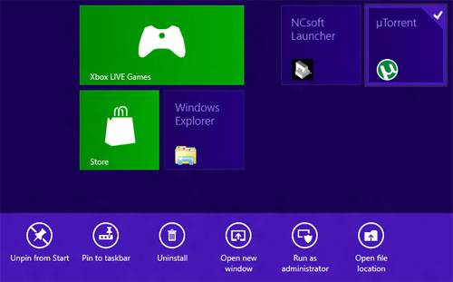
Instead, if you want to run a program as Administrator, you’ll need to right-click the tile and choose the option at the bottom. Every single time. Past that, there are no other options you can configure. If you need any of the aforementioned functionality, you’ll instead have to resort to finding the program executable on your PC and edit it there, or create a shortcut to the program on the desktop or taskbar and instead launch from there. This seems a little counter-intuitive given that Microsoft is forcing you to using the Start screen.
Things also get complicated when you want to create a shortcut that’s not already in the “Apps” list. Say, for example, you want to create a shortcut that you can click to shutdown your PC easier. To do this, you’ll need to create a shortcut in a very specific folder on your PC, which the Modern UI will then pick up so that you can add it to the rest of your tiles. Sheesh.
Start Screen: Junk Tiles
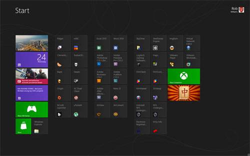
I concede that this problem is a difficult one to fix, but because of the goals of the Start screen, it stands out. In gist, any application you install that creates multiple shortcuts to executables will result in multiple shortcuts created in the Start screen also. The problem arises from the fact that a lot of these executables are, in effect, junk, and will never be used. The image below illustrates this perfectly:
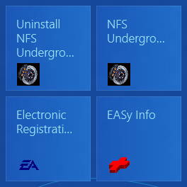
To remove the tiles you don’t want, you must right-click them and then choose the respective option at the bottom. This is a fair implementation, I suppose, but I find it easier on my Android devices to simply drag the icon to a trashcan. I could see that being even easier on a desktop PC, where you’d just click a tile and drag it to the corner. This only stands out to me as I’ve had to do it many times.
Start Screen: Where’s the customization?
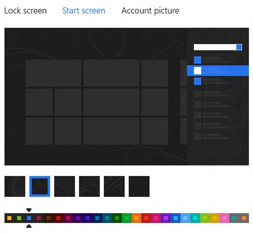
This one baffles me. We’re all supposed to be looking at the Start screen often, but for some reason, our options to customize it are limited to what’s seen below. We can’t put our own background image in there, can’t adjust the size of the tiles, can’t adjust the color profiles, can’t choose an option to color in your shortcuts to make them look like the main Modern UI apps and so on and so on. What… the hell?
There’s really nothing I can say here. This is just absurd.
Start Screen: No clock on the Start screen!?
Do I even have to elaborate on this one? We’re talking about an interface designed for mobile devices, and yet there isn’t even a clock on the main interface!
Support our efforts! With ad revenue at an all-time low for written websites, we're relying more than ever on reader support to help us continue putting so much effort into this type of content. You can support us by becoming a Patron, or by using our Amazon shopping affiliate links listed through our articles. Thanks for your support!


