- Qualcomm Launches Snapdragon 4 Gen 2 Mobile Platform
- AMD Launches Ryzen PRO 7000 Series Mobile & Desktop Platform
- Intel Launches Sleek Single-Slot Arc Pro A60 Workstation Graphics Card
- NVIDIA Announces Latest Ada Lovelace Additions: GeForce RTX 4060 Ti & RTX 4060
- Maxon Redshift With AMD Radeon GPU Rendering Support Now Available
Windows 8 Review – Part Two: The Things I Love

As difficult as it may be to tell sometimes, Windows 8 does in fact offer a lot to love. I’ve already had my say about what frustrates me with the OS, so now, I’m taking a look at the other side of the coin. What is it that makes Windows 8 pleasant to use? Select highlights include aesthetic improvements, the improved transfer dialog and the new syncing capabilities.
Page 1 – Introduction, Compatibility and Stability, Transfer Dialog & Improved Aesthetics
I’ve already had my say about what drives me bonkers with Windows 8, but now it’s time to look at the other side of the coin. Windows 8, before its launch, had been treated like Windows Vista after its launch, but is it well-deserved? Does Windows 8 bring enough to tablet table to warrant an upgrade – even if it only costs $40?
The answer to the first question is no… the hate towards Windows 8 is probably a little overdone. As for the second… that’s a question that’s very difficult to answer. After reading both my “Hate” article and then this one, you should have a far better idea of whether or not Windows 8 is for you.
Like the other article, this one is constructed as a list, and is in no particular order. Some of the choices might seem a bit silly, but if I have them here, it’s because I’ve truly found them to add to the pleasantness of the OS. So without further ado, let’s get to it.
Start Screen – Quick Search for Applications
In last week’s look at things I “hate” about Windows 8, I talked a bit about the search and how it didn’t bode too well with what I’m usually trying to do. However, there is one thing that helps me appreciate the design Microsoft chose here, and it has to do with launching applications through the Start screen.
Since Vista, the main method I’ve used for launching applications that don’t have a shortcut in my taskbar has been to search for them through the Start menu. While this may seem like a slow way of doing things, I can type fast enough where I can launch an application this way much faster than I could with the mouse. There was one issue, however. The results that came up weren’t only for applications, but documents and control panel options. Sometimes, I’d type in a partial word, hit enter, and have something else open up – obviously negating the speed I was looking for.
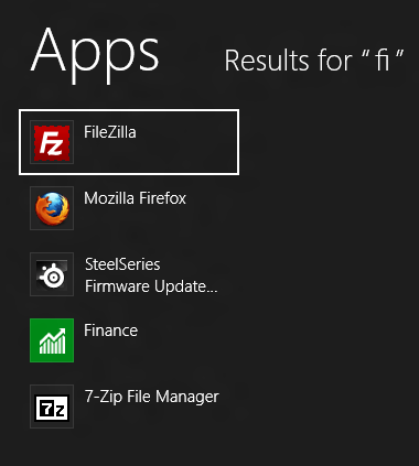
With the search inside of Windows 8’s Start screen, the results are always filtered. If you want to search for a document on your PC called “Finance”, you’d need to type it in, and then click on “Files” to the right. By default, it’s applications that load first, which means the chance of you opening up something by mistake this way is a lot slimmer than it was with 7.
However, I do have a minor complaint. Perhaps it’s done for performance reasons, but it be nice to see results from all three categories at once, rather than having to click on the filters to the right. I know many who use their Start menus to search for documents, music, photos and what-have-you, so this implementation would actually become pretty clunky for them.
Application Compatibility & Stability
There’s no shortage of material out there used to make fun of Vista, but a good chunk of it is well-deserved. When Vista first came out, it was a bit of a chore to use. Learning the new OS was one thing, but making things worse were the number of bugs and roadblocks that would arise when trying to run “legacy” software. Thankfully, 7’s launch didn’t mimic Vista’s, so overall, the transition between those was pretty seamless. With 8, the transition is even better.
In moving from 7 to 8, I didn’t lose access to a single one of my applications – everything just works. I do have the occasion when SmartScreen will nag me about a program I’m about to install, but none of those apps have given me any hassle once installed. And while I say “apps”, I’m referring to every piece of software I install, including games. So far, there’s not a simple issue I can speak of, and for a new OS launch, that’s impressive. That lengthy beta period sure seems to have paid off.
On a similar note, I haven’t experienced any instability to speak of, either. I do have the odd occasion when Notepad++ stalls on me, but I believe that to be related to a UAC issue I discussed in the other article.
Improved Aesthetics
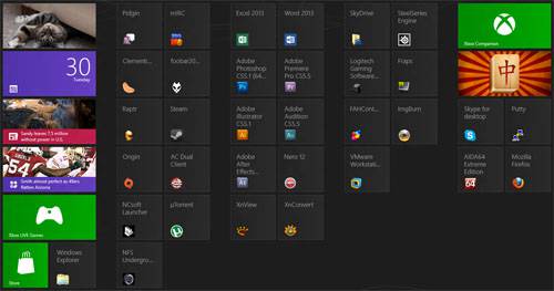
The jump in OS aesthetics from XP to Vista was enormous, but as we discovered, that doesn’t matter when the rest of the OS is painful to use. For the most part, 7 looked quite similar to Vista, and at the same time, 8 doesn’t look too different than 7. The main difference is that the window borders are no longer rounded, nor have a true glass feel. Instead, they’re all very square. “Tiley”, even, to match the Start screen.
The previous theme, Aero, was dropped in order to reduce reliance on the GPU. This in turn increases battery-life, and overall, it’ll be a change that most mobile users will be all for, especially when Windows 8 window designs still retain a similar look and feel.
That all said, I didn’t care for the super-square look of the latest OS at first, but after using it full-time for a little while, it’s grown on me to the point where it no longer stands out. It’s clean, I’ll give it that.
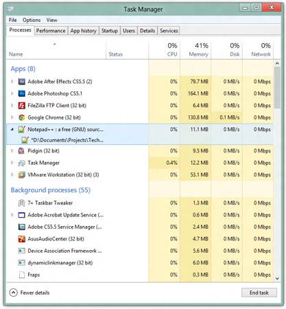
Window designs are just one aspect of the OS that Microsoft improved visually for 8, though. As seen in the above shot, the company even made something as simple as the Task Manager look a lot better. Its font choice is superb, as is the spacing and general layout. The color in the right-hand side serves a purpose, but it looks good at the same time. This is the sort of improvement that would have been great to see in 7, given that Vista already handled the bulk of the added visual appeal.
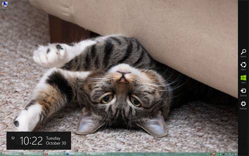
But here’s the thing about the improved aesthetics in Windows 8: a ton of them are the result of the OS’ obvious tablet focus. But… the result looks keen on a desktop or notebook as well. In the screenshot below, you can see the clean design of the “Charms” bar on the right and the time that comes up on the screen when you mouse over the top-right or bottom-right corners. The volume slider, when using media keys, also looks good in the top-left corner, and as it shows up over the top of all media / games, it’s offers a nice visual cue regardless of what you’re in the middle of doing.
While many of the other added aesthetic qualities of Windows 8 have to do with the Start screen, the OS as a whole features little enhancements that are noticeable if you’ve been using Windows a long time. Transitions and fades, for example, look great, and do add to the experience.
Refreshing Your PC
Due to the hassle it involves, no one likes to reformat their PC. But on the other hand, everyone generally loves the feeling of fastness that a reformat can bring. Well, Microsoft has heard our cries, and with Windows 8, giving your PC a “refresh” or format is easier than ever. You won’t even need to insert install media! Yes, another feature pulled straight from the books of the smartphone, although this idea isn’t new. Apple’s Mac OS X has had the quick-reformat capability in its past two versions.
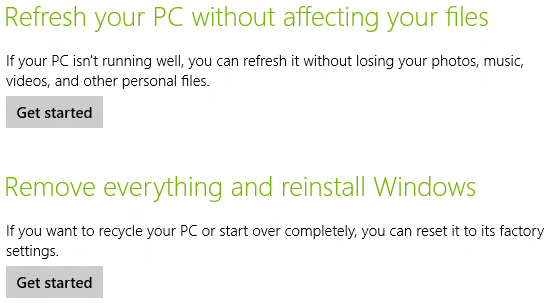
“Refresh” is for those who don’t want the hassle of backing up or moving their personal data. The OS is essentially brought back to its innate state. Once the process is finished, you’ll be in a clean Windows 8 install but still have immediate access to all of your personal files (those kept in your Libraries).
For a truly fresh start, the second option will purge everything on the drive, sans Windows itself, and then reinstall itself. What you’ll be left with is the same result as reformatting your PC and installing Windows from the disc.
This isn’t a feature I’ve actually taken advantage of yet, but it’s one I love just the same. If I had to reformat my Windows install for whatever reason, this is definitely the route I’d take.
Improved Copy Dialog
This may seem like a minor feature to some, but for those who copy data back and forth often, this is quite an upgrade. The big addition here is a live graph that shows the speed at any given time throughout the entire transfer. This allows you to see if there was some data where the speed plummeted, and allows you to guess how long the entire transfer will take without relying solely on Windows’ guess.
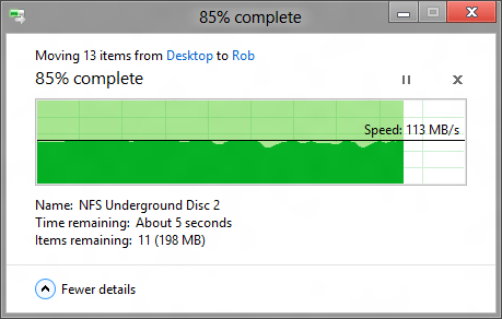
There have been times where I’ve found myself juggling up to four transfer dialogs at once, and Windows 8 goes on to simplify that. Instead of having a separate dialog box for each transfer, everything gets combined to one, while still retaining their own respective data and pause buttons. Microsoft has also simplified conflicts. Images, for example, will show a source and target version, so you can see if one is newer than the other and proceed from there.
Support our efforts! With ad revenue at an all-time low for written websites, we're relying more than ever on reader support to help us continue putting so much effort into this type of content. You can support us by becoming a Patron, or by using our Amazon shopping affiliate links listed through our articles. Thanks for your support!


