- Qualcomm Launches Snapdragon 4 Gen 2 Mobile Platform
- AMD Launches Ryzen PRO 7000 Series Mobile & Desktop Platform
- Intel Launches Sleek Single-Slot Arc Pro A60 Workstation Graphics Card
- NVIDIA Announces Latest Ada Lovelace Additions: GeForce RTX 4060 Ti & RTX 4060
- Maxon Redshift With AMD Radeon GPU Rendering Support Now Available
Apple TV (2010)
The latest Apple TV media streamer is here, and unlike the original that launched in 2007, this one has a lot of competition. It features a super-small frame, fantastic iTunes movie rental and Netflix support, a clean-looking and smooth-operating interface and overall good performance. But can Apple’s latest compete with the established competition?
Page 5 – Podcasts, Flickr & Radio
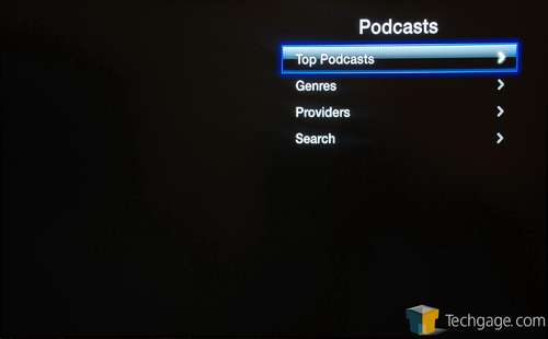
The Apple TV prides itself on availing its users of quick iTunes movie rentals, but for those who enjoy a good podcast now and then, or everyday for that matter, Apple’s latest device is perfect for that use as well. Once into the menu, you are able to peruse the top podcasts, genres, providers (this is a fairly limited list), or go right to the source by searching for it.
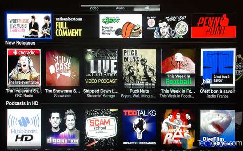
The interface seen here is quite similar to the one seen when browsing the movie rentals. The top pane lists featured content, while different categories split up the rest. Of most interest to those who want to take good advantage of their HDTV, there’s a good list of HD content, and like on iTunes, the selection almost feels unlimited.
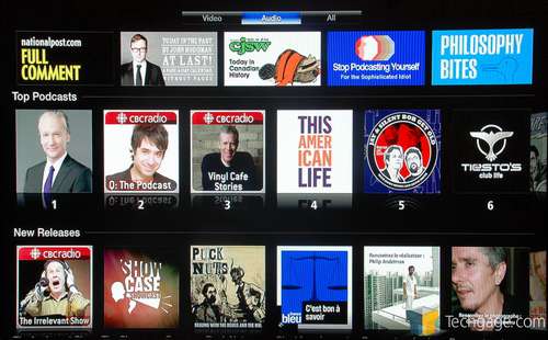
If you want to chill out to audio, not video, or want to preserve bandwidth, you can change the filter at the top of the screen to list only the audio. Again, since I’m in Canada, most of the content I see reflects that.
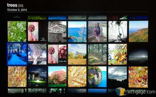
Tackling Flickr, I once again have to say that Apple’s usage of the Web service here is the best I’ve seen. I hate to keep saying this about every feature so far, but up to this point, it’s been true. On many media players I’ve used, searching for something under Flickr would be a finicky process, sometimes induced with lag. That really wasn’t the case here, as the interface has a heavy focus on smooth usage.
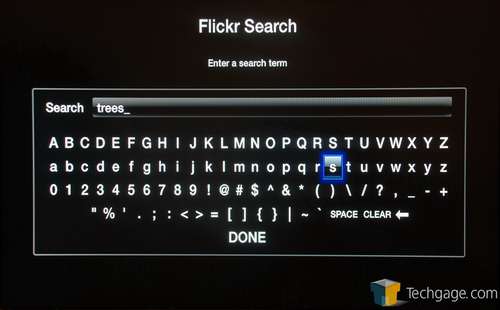
Like YouTube, you can log into your Flickr account and navigate things that way, or if you simply want to kick back and browse some photos, you can search for any term easily enough:
Once your results are loaded, you’ll be able to browse them all, and if you click on one to bring it full screen, you can simply hit left or right on the remote to go to the next or previous image – another really nice feature.
Once again, image quality is difficult to portray here, but from all I browsed, it couldn’t get much better.
After seeing the implementations of all the features up to this point, I looked forward to checking out what was available for radio, since that’s a feature I find falls flat on a lot of devices (clunky on the O!Play, subscription-based on the WD TV). Fortunately, Apple once again delivered here, with what’s easily the best radio feature I’ve seen.
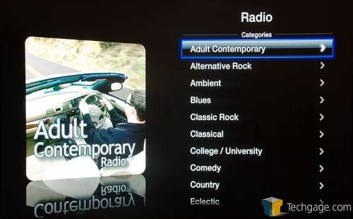
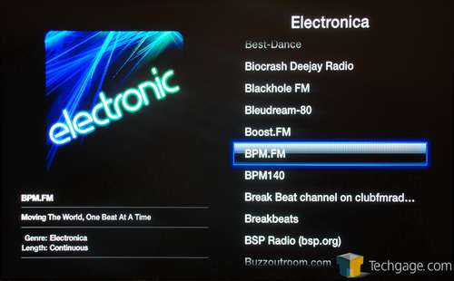
You’ll first be greeted with a large list of different categories, and surely, no matter what you’re in the mood for, you’re going to find something to suit it here. Once you go into one of these categories, you’ll be able to peruse a massive list of available radio stations. Of these, many are online-based, but there are also a ton of regular radio stations as well. Chances are, unless it’s a local station in a small town, it will be available here. There were some exceptions, though. I couldn’t find the Edge (Toronto, Ontario) listed here, despite it being a popular one.
Here’s an example of one list, which can at times be huge (some categories had hundreds of stations):
Unfortunately, there is one glaring omission with the radio feature here. For whatever reason, even if you listen to a station that supports displaying the current song being played, the Apple TV won’t show it to you. This is a huge problem for me since if I hear a song I really dig, it’s frustrating if I can’t immediately find the name of it. Oddly, such a feature would be perfect on the Apple TV, since Apple could allow you to add the currently-played track to your iTunes wishlist. Maybe someday…
Support our efforts! With ad revenue at an all-time low for written websites, we're relying more than ever on reader support to help us continue putting so much effort into this type of content. You can support us by becoming a Patron, or by using our Amazon shopping affiliate links listed through our articles. Thanks for your support!


