- Qualcomm Launches Snapdragon 4 Gen 2 Mobile Platform
- AMD Launches Ryzen PRO 7000 Series Mobile & Desktop Platform
- Intel Launches Sleek Single-Slot Arc Pro A60 Workstation Graphics Card
- NVIDIA Announces Latest Ada Lovelace Additions: GeForce RTX 4060 Ti & RTX 4060
- Maxon Redshift With AMD Radeon GPU Rendering Support Now Available
Chrome – Google’s Attempt at the ‘Ultimate Browser’

Sure, the Internet has no shortage of web browsers, but it’s not often that someone comes along and tries something different, and believe it or not, it’s Google this time around. We’re taking a look at the first beta release of their Chrome browser, which happens to be ultra-fast, stable, intuitive and lightweight, all at the same time.
Page 2 – Chrome Features, Final Thoughts
Creating a browser might sound simple, but the route Google wanted to take complicates things. How can you create a browser that on one hand is rich with features users want or need, while retaining a small footprint, and not becoming clunky. Well, Chrome is off on the right foot so far, and I’m already looking forward to follow-up beta releases to see how Google is going to keep within their goals.
The first sign of Chrome’s light-weightedness might be during the installation. After the download completes and the installer is initiated, the entire app is installed within seconds. If you have Firefox (and presumably, other browsers) installed, it will offer to carry over your bookmarks and certain settings. I went ahead and allowed it to use my Firefox profile, and it did just that. All of my bookmarks were available and even custom settings that I had set in the ‘about:config’, such as which default search engine to use.
Although I like minimalism to a certain degree, I’m always wary about developers that take things too far. Google seems to have found a good level of where to take things though, and although the browser seems like it’s feature-less at first, you really have to look deep in order to see just what it’s made of.
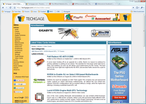
First and foremost, this is one great-looking browser, under both Windows XP and Vista. It features clean lines, sharp text and a total lack of top menus, giving the design an even cleaner look. It does seem overboard at first to cut so much out, but after just a few minutes of browsing, you won’t even notice… at least that’s how things played out for me.
Minor Features
Rather than having the browser tabs located underneath the address bar, Google changed things up by placing them above, adding to the clean design and look. Since there is no top menu, there’s lots of room, so it seems to be the logical choice in placement. Google’s goals, as stated in their introduction video is that they wanted the browser frame itself to be as small as possible, within reason, to maximize what everyone uses a browser for… the web.
At current time, the UI cannot be configured much, and what’s there will remain there. I assume that with concurrent releases, such ability will be added, but it all depends on personal taste and what you want, whether or not it’s a real inconvenience. Plugins are also lacking right now, in that there is none. That’s due to be added, however, just like Firefox’s extensions.
Continuing with the goals of a clean UI, there is no bottom status bar. If you hover over a link, it will fade in and out at the bottom, but disappear once you move your cursor away. The lack of a bottom bar results in a few extra pixels that are dedicated to increasing the amount of the webpage you see. The UI as a whole is intuitive, and I’m actually impressed by how much I turned out to like it.
At this point and time, the coolest features of Chrome are features you don’t really see, but rather are part of the architecture that simply make the browsing experience better. Pop-ups, for example, won’t open up into a tab that they didn’t originate in. It’s simple things like that, that increase the cool-factor.
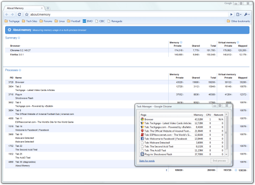
On feature sure to go overlooked by many is the built-in task manager, which you can see above. Right-clicking on the main UI and launching the mini-app will pop up the smaller window seen in that image, which shows very basic information about memory and CPU usage for all of the available tabs, even tabs open from additional instances of Chrome. Clicking on ‘Stats for nerds’ opens up ‘about:memory’ which goes even further in-depth, and goes as far as to include stats from other currently-open browsers. Note that these statistics even include the memory usage of the installed plugins.
Final Thoughts
Much more could be said about Google’s browser, but given that we are only seeing the first beta, it would be wise to wait and see what the future versions will bring to the table, before exhausting our database space. I’m not the type of person to be impressed that easily, especially by a web browser, but Google has more than impressed me here. I’m sure glad I didn’t bet money before the beta became available.
At the time of writing, Google is offering only a Windows version of the browser, but they promise that OS X and Linux support is en route, so we can only hope that the browser delivered to those OS’ will be just as impressive as the one for Windows. What’s interesting is that the browser is good now, and it’s only the first beta. That’s a good sign.
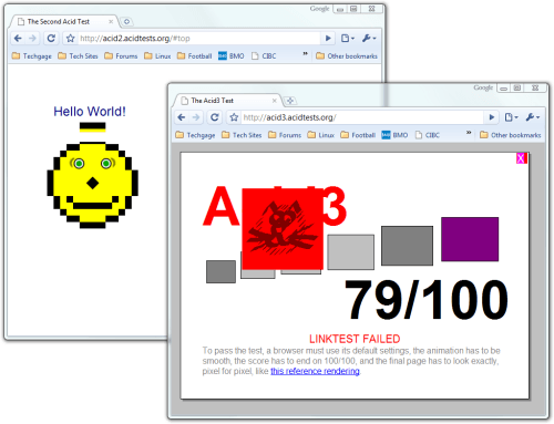
What needs work is a few things, such as web standards compliance. Although ACID2 passed without fail, it broke whenever the browser window was resized, and ACID3 scored 79/100 – good, but not ideal. Some users are also reporting some sites to run slower than others (compared to other browsers), although I haven’t experienced such a thing yet. I’m sure after days of use, such issues will creep up, but as it stands, for a first release, things should only get better.
At this point in time, there’s little use in throwing requests around, because I’m sure Google has other features in their roadmap that they are not talking about yet, such as plugin support, GUI customization, the ability to customize your speed dial and more.
If you haven’t already, you should give Chrome a try yourself. It’s a super-quick download, and hey, you might just like it. For alternate looks at the browser (mine wasn’t good enough?!), check out Google’s comic strip, features video and ’10 features of Chrome’ video, to help yourself get better acquainted.
Discuss in our forums!
If you have a comment you wish to make on this article, feel free to head on into our forums! There is no need to register in order to reply to such threads.
Support our efforts! With ad revenue at an all-time low for written websites, we're relying more than ever on reader support to help us continue putting so much effort into this type of content. You can support us by becoming a Patron, or by using our Amazon shopping affiliate links listed through our articles. Thanks for your support!


