- Qualcomm Launches Snapdragon 4 Gen 2 Mobile Platform
- AMD Launches Ryzen PRO 7000 Series Mobile & Desktop Platform
- Intel Launches Sleek Single-Slot Arc Pro A60 Workstation Graphics Card
- NVIDIA Announces Latest Ada Lovelace Additions: GeForce RTX 4060 Ti & RTX 4060
- Maxon Redshift With AMD Radeon GPU Rendering Support Now Available
Social & RSS Feeds
Latest Videos

Latest News
Logitech io2 Digital Writing System
by K. Samwell on October 10, 2006 in Peripherals
If you enjoy hand writing more than typing, then the io2 pen was made for you. Though this is a product that’s been out for a while, we are taking a fresh look at it today to see if it stands the test of time. In the end, it still proves to be a quality product worthy of your consideration.
Page 2 – ABCs and 123s
|
|
Now I knew that this wasn’t going to be a pick up and go device. Handwriting recognition software has come a long way since the Newton and I was actually surprised at how little I had to write in order for it to start picking up on my quirks. Software installation was quick and painless, though I was a little uneasy about the 8 separate requests for internet access by different components of the software.
Here is a screenshot of the handwriting analysis page. You are asked to PRINT the alphabet, numbers and symbols, then cursively write out the sentences. While it had some issues with one of my sentences I believe it was due to my writing too close to the right hand edge. You always have the opportunity to correct what it has assumed and thereby teach it your own personal style of writing.


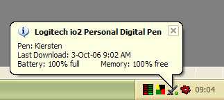
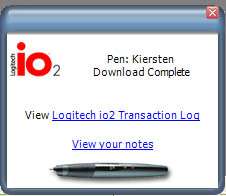
I was pretty impressed that with my scrawl it had no problem validating my entries on the first try. I’m not the neatest writer, as you can see, and eventhough it gives you hints about spacing between words, height of uppercase letters and such, it took my chicken scratch and made something of it. Once you’ve completed this tutorial, go make coffee, because the software takes about 15 minutes to grind thru all your barely legible writing to make your profile. And thankfully, you can have as many profiles as you like so multiple users can take advantage of the pens use. As soon as you dock the pen, the software pops up, telling you your battery status, your memory status and how many documents you have ready to upload.
Sample Quote
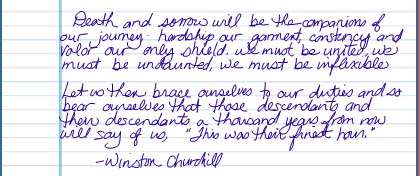
And so the test. Here is one of my favourite quotes from Churchill, I can hear his voice when I read it.
Death and sorrow will be the companions of our journey; hardship our garment; constancy and valor our only shield. We must be united, we must be undaunted, we must be inflexible…Let us then brace ourselves to our duties and so bear ourselves that those desendants and their descendants a thousand years from now will say of us, "This was their finest hour." – Winston Churchill
Became…
Which then was translated to Microsoft word as the following.
Death and sorrow will be the companions of our journey,. hardship our garment, constancy and rotor our only shield. We must be united, we must be undaunted, we must be inflexible.
Let us then brace ourselves to our duties and so bear ourselves that those deadbeats and their descendents a thousand years from now will say of us, ”This was their finest hour." -Winston Churchill
Now to be honest with you, that was better than I had expected, only two errors and one of them incited much hilarity.
(deadbeats instead of descendants..but then again…)
Chances are this is about as accurate a sample as if I had written 10 pages of text, and in the long run, this would probably force me to practice better penmanship, which is never a bad thing. Sadly when a speaker is talking, pointing to slides and I’m trying to get it all down before he moves on to the next slide, my penmanship is not at its finest. Overall, it beats typing the entire lecture out again, trying to read that hurried scrawl hours or days later.
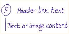
Now one handy feature that I only played with a little was their ioTags. What these are, are symbols you use to notate what you are writing based on what it is intended for. ioTags are basically an uppercase letter enclosed in a circle. It tells the Logitech io2 Software that you want an action to be carried out on the associated pen strokes. There are some default ioTags: E for Email message, C for Calendar appointment, T for To Do item, S for io document, and W for Word document. You can modify these and add new ioTags. Then beside that Tag is the header line, this is the ‘title’ of the item.
For example, for an email-creating ioTag, the header line may contain the email subject and the email address. There’s the content line, which is drawn down the left of the page; this line defines the pen strokes in your item’s content. This selection bar needs to be vertical, directly below the tag itself, and adjacent to the content. If you use the W tag to create a Word document and don’t draw this vertical line, then the entire page is sent to conversion. And finally the content. The actual pen strokes that form the content of the item you are creating (for example, email, To Do entry, and so on).
Sounds complicated but it’s really not, here’s a pic:
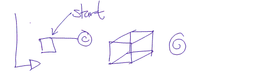
A picture paints a thousand words. Dammit Jim I’m a writer not an artist. I drew quite a few scribbles that would pass for flow charts, and similar images based on primitives, however I really wanted to see how it would perform on a more complicated image.
Now I’m not saying this is overly complicated, but it incorporates different line weights, which are crucial to any type of freeform sketch, so here are the results.
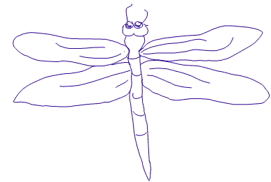
As you can see, line weights were not taken into account. The lines within the wings of the dragonfly were much fainter while its body was much more pronounced. All in all, this isn’t for creating your next gallery masterpiece, but for simple diagrams, outlines, and primitives, it works wonderfully, as shown below.
|
|

Support our efforts! With ad revenue at an all-time low for written websites, we're relying more than ever on reader support to help us continue putting so much effort into this type of content. You can support us by becoming a Patron, or by using our Amazon shopping affiliate links listed through our articles. Thanks for your support!