- Qualcomm Launches Snapdragon 4 Gen 2 Mobile Platform
- AMD Launches Ryzen PRO 7000 Series Mobile & Desktop Platform
- Intel Launches Sleek Single-Slot Arc Pro A60 Workstation Graphics Card
- NVIDIA Announces Latest Ada Lovelace Additions: GeForce RTX 4060 Ti & RTX 4060
- Maxon Redshift With AMD Radeon GPU Rendering Support Now Available
A Quick Look at Steam’s ‘Big Picture’ Mode
Valve rolled out the beta for Steam’s “Big Picture” mode last night, and as someone with little-to-no patience, I dove right in. As mentioned in our post from yesterday, Valve designed Big Picture with a gamepad in mind (*gasp*), so I was interested to see how smooth the interface would be – after all, Valve is best known for PC stuffs, not console.
After spending a few minutes with it, I must say I’m impressed. While it’s still a bit crash-happy upon exit (at least for me), the interface is gorgeous, and animations fluid. I tested the interface on a computer display, but it’s not hard to tell just how well-designed this UI is for the TV. Everything is big, as the name would suggest, and although there’s a lot of functionality to take advantage of, it only takes a few steps to get anywhere.
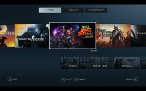
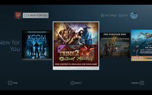
The screenshot to the left below is of the main screen, and the right is what it looks like when you select a game. This screen is full of information; achievements, friends who play, screenshots… it’s all here. At the moment, Big Picture is very much a beta, so some information simply doesn’t exist.
The store is straight-forward; simple to use and navigate. It’s one of the better implementations I’ve seen, in fact. In the above left shot, you might have noticed the “5 New” ticker up top. Clicking this reveals the screen to the right below. It’s essentially a recommended list of games. Whether or not this is based on your owned game collection on Steam, I’m not sure.
With Valve’s insistence that it’s created a browser that “isn’t lame”, I couldn’t wait to check it out. While it is indeed smooth and classy-looking, I find it a little clunky. The right analog stick on my gamepad skews the page size, which I found a bit odd, and the left analog stick simply moves it around. Imagine swiping a webpage on a tablet to the left, and half of the page suddenly be missing. That’s what happens here. Further, I couldn’t figure out how to enter text in a search engine text box, although I could edit the address bar.
To the right above is an example settings screen in Big Picture. Again, everything is squeaky-clean and presented in a common-sense way. From this settings area you’ll also be able to edit your account settings – a nice convenience.
Overall, I’m pretty happy with Valve’s work here. I don’t personally have a need for a “10 foot” UI, but I’d imagine that those who do, will like this. I might consider using it in the future if it supports more than just Steam games, however. If support is added for your personal video and audio collections, this really could become a high-ranking media center solution.


