- Qualcomm Launches Snapdragon 4 Gen 2 Mobile Platform
- AMD Launches Ryzen PRO 7000 Series Mobile & Desktop Platform
- Intel Launches Sleek Single-Slot Arc Pro A60 Workstation Graphics Card
- NVIDIA Announces Latest Ada Lovelace Additions: GeForce RTX 4060 Ti & RTX 4060
- Maxon Redshift With AMD Radeon GPU Rendering Support Now Available
AC Ryan Prepping UI Update for Playon!HD Models
Over the course of the past couple of months, we’ve taken a look at a fair number of set-top media players, including two similar models from AC Ryan, called the Playon!HD. I took a look at the “mini” variant in September, while Brett took the non-mini for a spin just a couple of weeks ago. Overall, our sentiments weren’t too far apart from one another, and one thing we both agreed on was that the device could really use a graphical overhaul.
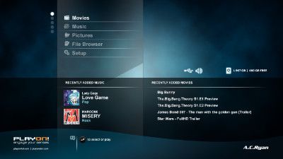
As both Brett and I mentioned in our respective reviews, AC Ryan told us that it would be releasing a graphical firmware update in the near-future, and as we can now see, the company has stuck to its word. Last week, one of its staff members posted a detailed forum thread showing off the interface that’s coming with this future update, and, well… my jaw dropped.
As I had kind of a bad taste in my mouth with the current UI available to owners of the Playon!HD, I wasn’t quite sure what AC Ryan could pull out of its hat, but color me impressed. The new interface is clean, modern, well-organized, and might just be one of the best-looking interfaces I’ve ever seen for a media player. It’s that good.
The interface looks much easier to use, although I do question the use of a non-qwerty keyboard layout. Hopefully there will be an option in the final version to choose between either style. The company also makes good use of transparency here, which is very prevalent when using the menus while watching a movie. You can read a lot more at the URL below, and you can be sure we’ll be posting our thoughts on the update as soon as we’re able to apply it to our units.

The main menu will always have 5 options visible and the others are hidden in a carousel when you are moving up and down. The gray and white dots on the left are indicators of where you are in the main menu. The more menu options, the more dots. For the Playon!HD and Playon!DVR-HD there will be significantly more options than in this current example (which is for the Playon!HD Essential).


