- Qualcomm Launches Snapdragon 4 Gen 2 Mobile Platform
- AMD Launches Ryzen PRO 7000 Series Mobile & Desktop Platform
- Intel Launches Sleek Single-Slot Arc Pro A60 Workstation Graphics Card
- NVIDIA Announces Latest Ada Lovelace Additions: GeForce RTX 4060 Ti & RTX 4060
- Maxon Redshift With AMD Radeon GPU Rendering Support Now Available
Dramatically Enhance The Look Of Your Steam Client With New ‘Pressure’ Theme
Despite the fact that I appreciate great aesthetics and find Steam’s default interface to be a bit lacking, I’ve never felt compelled enough to deal with the hassle of installing a replacement theme. Time and time again, I’d spot a neat theme and be intrigued, but for some reason still wouldn’t go through with it. If that’s not the definition of laziness, it should be.
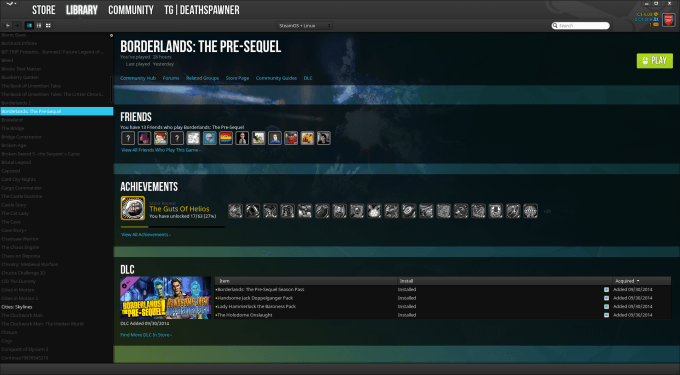
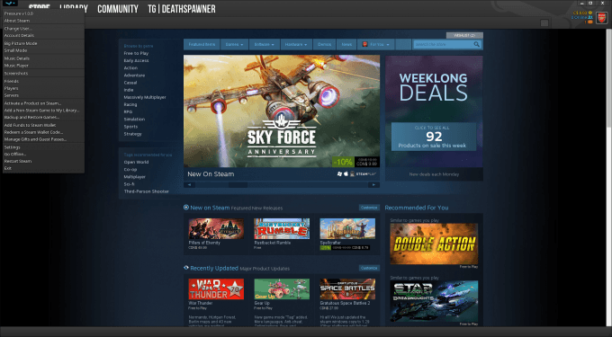
Well, after spotting a brand-new theme called “Pressure” last night, I managed to break through my ridiculous resistance and give it an install. Boy, am I glad I did. Just look at it:
What Pressure managed to prove to me is that Steam’s default interface is… well, lackluster. It’s not just that Pressure looks awesome, it does a far better job of highlighting certain areas of the interface to make them stand out more. If you use the grid view in the Library mode, for example, and have it set to show all available games, Pressure will dim the games that are not installed to make it easier to differentiate which ones are or are not installed. The theme also colors triggers in Steam chat better; green for trade, and orange for an invite to a game.
One perk that appeals to me is that Pressure is supported for Windows, OS X, as well as Linux. Clear instructions on how to install it for each platform are listed at the theme’s homepage. Part of what makes the theme look so great is its fonts, so you’ll need to install a handful of those manually in order to experience it as it’s meant to be.
Pressure’s developer, Dirt Diglett, says that he’s put considerable time into its development over the past year-and-a-half. Despite that, he doesn’t plan on halting development, and welcomes those who enjoy the theme to kick him a few dollars, as there’s “never enough coffee”. Well said.


