- Qualcomm Launches Snapdragon 4 Gen 2 Mobile Platform
- AMD Launches Ryzen PRO 7000 Series Mobile & Desktop Platform
- Intel Launches Sleek Single-Slot Arc Pro A60 Workstation Graphics Card
- NVIDIA Announces Latest Ada Lovelace Additions: GeForce RTX 4060 Ti & RTX 4060
- Maxon Redshift With AMD Radeon GPU Rendering Support Now Available
Google Updates its Play Store, Rollout Should Take a Couple of Weeks
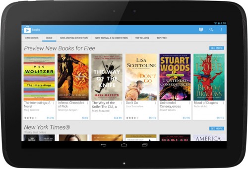
Google has just launched a major update to its Play Store for mobile devices (an update to the website hasn’t been mentioned), and from initial screenshots, it looks quite good. It’s clean, modern, colorful and attractive. While I didn’t find too much wrong with the previous iteration of the Play Store, I feel this update is a huge improvement.

The company’s take: “The new design focuses on bigger images that jump off the page. Similarly themed content is grouped together so you can hone in on a magazine to read or an app to try. As you move down the page, new recommendations continue to appear so there is always more to see and explore. We’ve also simplified purchasing so you can breeze through checkout and get to enjoying your movie rental or other content.“
Interestingly, this is about all that Google’s saying about it right now. I actually don’t recall ever seeing the company post such a short blog post about something rather significant before – it’s almost strange. It could be that there isn’t too much to talk about, but it is quite a stark contrast to the amount of information we usually get out of the company.

What we do know is that this update will affect anyone using Android 2.2+, and the rollout will take weeks, not days. As of the time of writing, none of my devices have clicked into the new store, and if I recall, with the last update, the process took about a week (being based in Canada). I look forward to taking it for a spin, because it really does look quite nice.


