- Qualcomm Launches Snapdragon 4 Gen 2 Mobile Platform
- AMD Launches Ryzen PRO 7000 Series Mobile & Desktop Platform
- Intel Launches Sleek Single-Slot Arc Pro A60 Workstation Graphics Card
- NVIDIA Announces Latest Ada Lovelace Additions: GeForce RTX 4060 Ti & RTX 4060
- Maxon Redshift With AMD Radeon GPU Rendering Support Now Available
Google Reader Gets Updated Gmail-like Design
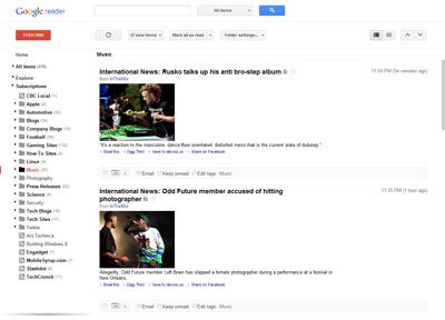
Halloween is known for its dark colors, copious amounts of candy and of course, lots of decorations. So what better time would there have been than yesterday for Google to unveil is revamped Google Reader, which is about as minimalist as it gets, with more white than the Google homepage (alright, perhaps not that much white)?
Much like Gmail’s revamp a couple of months ago, which also saw the introduction of a lot of white and a clean design (which I happen to love, but a lot don’t), the new Google Reader follows in the same footsteps and shares the same aesthetics. It’s interesting that the change has happened, as I often found Google Reader to be a little unattractive – but, did it matter? Not really. It’s just a simple reader, after all. Function over form.
I do admit that I like the new design for Reader even so, though I do feel there is a little (read: lot) too much whitepsace. On the left is a simple list with bold black font, and on the right, the contents of your feeds. Again, there’s quite a bit of whitespace here, but overall I find it looks clean and is easy on the eyes.
The biggest addition is also a removal. There’s now +1 buttons present on each feed, but because of that, Google has removed the ability to use sharing features present before (I am not familiar with them since I never used them). This is unfortunate as it seems that a lot of Google Reader users had used them quite frequently.
Either way, like it or hate it, the new Google Reader is here to stay. Not all of the changes are that welcomed, but if there’s one thing that’s true about Google, its decisions are almost always final, even in spite of outcry.


