- Qualcomm Launches Snapdragon 4 Gen 2 Mobile Platform
- AMD Launches Ryzen PRO 7000 Series Mobile & Desktop Platform
- Intel Launches Sleek Single-Slot Arc Pro A60 Workstation Graphics Card
- NVIDIA Announces Latest Ada Lovelace Additions: GeForce RTX 4060 Ti & RTX 4060
- Maxon Redshift With AMD Radeon GPU Rendering Support Now Available
Microsoft Announces Windows Phone 7 to Much Fanfare
To say that Microsoft has been having quite the good year thus far would be an understatement. Windows 7 is selling well, and without much major complaint from its users, and as mentioned mere weeks ago, Internet Explorer 8 is somehow the Web’s most popular browser. Improvements haven’t halted there, though, as surprisingly, the entire Internet seems to be in huge support of Microsoft’s upcoming mobile OS as well, Windows Phone 7.
“You must mean Windows Mobile 7“… no, sir/ma’am. Microsoft’s phone OS has been built from the ground up, so it seems, and it’s such a major overhaul that it pretty-well required a fresh name, so that’s the route Microsoft took. I admit I’m not that familiar with phone OSes and especially Windows Mobile, but even I could never ignore the constant bagging it received from friends who’ve had to dealt with it.
That’s why it’s surprising to see Windows Phone 7 so well-received, especially because it seems to me that the reason it’s so popular is for things I thought most people hated, such as a minimal UI. That’s the most interesting change Microsoft made here, and it took a massive risk in doing so. Sure, the iPhone OS could be considered minimalist in some regards, as would almost all mobile OSes, but Microsoft takes things to a new level.
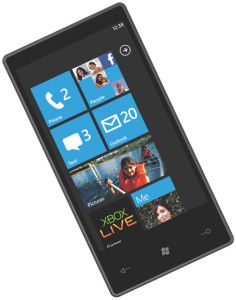
If you’ve ever played with a Zune, you can pretty much already garner the experience of Phone 7. Menus seem to handle similarly, and everything is organized in an easy-to-find manner, as you can see in the image below. Everything looks fluid, and the functionality itself seems to be top-rate. I haven’t seen much bad comment about it so far, and I’ve even seen the term “Microsoft Has Out-Appled Apple“. Now we’ll see if the enthusiasm remains when the OS gets released later this year.

The minimal aesthetic will not be to everyone’s taste; the oversized text in particular seems to raise eyebrows. I personally think it looks good, but more importantly, Windows Phone 7 Series has a definite look to it, just as the iPhone does. Windows Mobile 6.5 is a mish-mash of different concepts, with some parts finger-friendly but many not. Different parts use different styles, with the result that it feels very disjointed—there’s no particular Windows Mobile look-and-feel. Windows Phone, in contrast, has a very strong visual identity; all the screens are clearly Windows Phone with consistent user interaction and styling.


