- Qualcomm Launches Snapdragon 4 Gen 2 Mobile Platform
- AMD Launches Ryzen PRO 7000 Series Mobile & Desktop Platform
- Intel Launches Sleek Single-Slot Arc Pro A60 Workstation Graphics Card
- NVIDIA Announces Latest Ada Lovelace Additions: GeForce RTX 4060 Ti & RTX 4060
- Maxon Redshift With AMD Radeon GPU Rendering Support Now Available
Microsoft Updates Company Logo
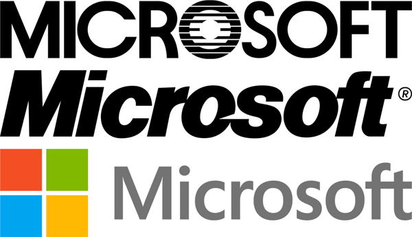
Microsoft has had the same logo for the past 25 years, so with such an ambitious Windows 8 launch ahead of it, wouldn’t it be a good idea to modernize it a little bit? Well, the company thought so, as it today rolled out a brand-new logo that looks nothing at all like the logo of old. Given Microsoft’s logo updates in recent years for its other products, this new main logo shouldn’t come as much of a surprise. It’s clean, modern and crazy easy to create an SVG lossless of (if it wasn’t already supplied) due to its simplicity.
Below, you can see Microsoft’s three company logos used since the company’s inception. The first was used between 1982 – 1987, while the middle one has obviously been used since then until just yesterday.

What do you guys think of Microsoft’s new logo?


