- Qualcomm Launches Snapdragon 4 Gen 2 Mobile Platform
- AMD Launches Ryzen PRO 7000 Series Mobile & Desktop Platform
- Intel Launches Sleek Single-Slot Arc Pro A60 Workstation Graphics Card
- NVIDIA Announces Latest Ada Lovelace Additions: GeForce RTX 4060 Ti & RTX 4060
- Maxon Redshift With AMD Radeon GPU Rendering Support Now Available
Techgage’s Upgrades – What’s Changed & What’s in Store
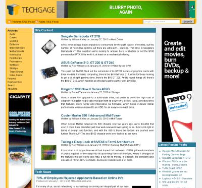
A little over a week ago, I made a forum post that discussed some upcoming changes to the site, some of which are clearly obvious even without reading this. Our original goal was to begin working on the back-end, and some of the front-end, and roll out changes in a progressive manner rather than save up a major amount of code and upgrades and unleash it all at once.
We were planning to take things a little slow, and focus on some of the smaller issues that has plagued the site for a while (these go beyond the scope of a news post). We also had plans to upgrade our content management system in order to include some additional functionality that it’s been lacking (aside from certain Web language libraries, our site is completely built from the ground-up).
Our intentions was never to alter the site’s template that much, until the time came that we were prepared to upgrade the entire site’s look and design, but as we were tinkering around, we ended up making minor changes that we felt made a major difference in the overall feel of the site. One thing led to another, and after a week’s worth of discussion among TG staff, we have what you see here today; not a complete overhaul, but rather a noticeable upgrade.

So, what have we changed? Most of what we modified is minor, but I’ll list some of the key points here:
- Overhauled site header. We’ve improved the integration of our 728×90 advertisement, while also offering quick access to both our RSS feeds and also the site search.
- For improved reading, we’ve spaced out the lines in our articles. This will likely precede a complete font change down the road.
- Our news section has been restructured. Rather than continue to be called a “blog” by advertisers and other media, we’ve greatly shortened the front page by offering only a quick blurb of our full news post, with the option to “Read More” for news items you are interested in reading. This is not likely to be our final alteration here, but it’s far better than what we had before.
- For the sake of even easier content navigation, we’ve replaced the drop-down menu at the bottom of each article page with a simplified page list that exposes all of the article’s pages at once. This method gives a much better overview of the article, and allows you to quickly find the page you’re looking for.
- We made some minor aesthetic tweaks that improve the overall appeal of the site.
As it stands today, I truly feel that the changes we made to the site over the weekend greatly improve the overall experience of navigating around and reading the content. But, we still have a long way to go before we can reach what I consider to be the next major revision of the site, but as mentioned earlier, we’re going to take a more progressive approach to this, since even as it stands today, we have no idea exactly of what we want. Once all of the back-end upgrades have been made, and the site front-end has been tweaked to our liking, we’ll likely go ahead and explore doing a complete template overhaul to bring a fresh coat of paint to the site.
We couldn’t make such changes to the site and not look for feedback, so if you have any comment at all, please feel free to hit up our comment thread below and spill it. Any suggestions, criticism and what-have-you is appreciated.


